Discover the evolution of Jaguar’s logo and how its new design embraces simplicity and modernity.
Why Jaguar’s Rebranding Is a Big Deal
Rebranding isn’t just about changing a logo—it’s a statement about the brand’s vision and how it wants to be perceived. For Jaguar, a name synonymous with luxury and performance, the decision to ditch its iconic jaguar emblem is nothing short of revolutionary.
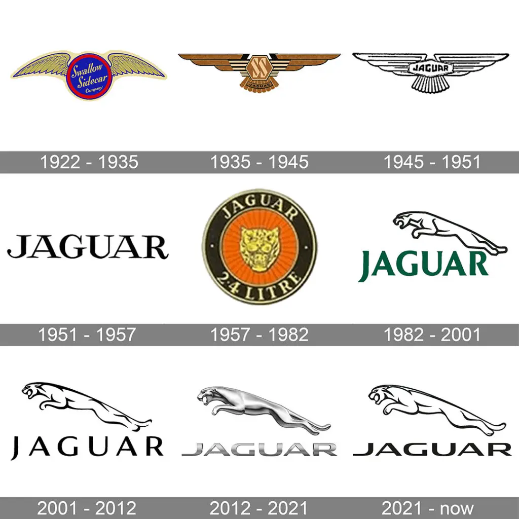
The iconic leaping jaguar has graced the hoods of luxury cars for decades, becoming a symbol of elegance and power. Since its introduction in the 1950s, the logo has undergone various iterations, including the sleek side-profile design from the 1980s.
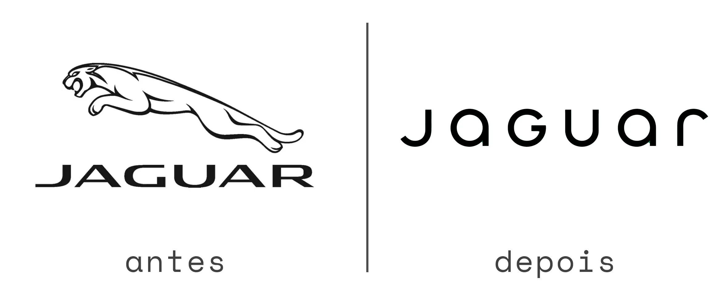
Now, in a daring move, Jaguar is turning a new page, replacing the well-known imagery with a minimalist typographic design. The change signals not just a visual shift but a deeper alignment with modern design trends and a forward-thinking brand identity.

The Evolution of Jaguar’s Logo
Jaguar’s logo has always reflected its core values of agility, power, and sophistication.
- 1950s – The Face of the Jaguar:
- The original logo featured the jaguar’s face, symbolizing focus and ferocity.
- 1980s – The Leap Forward:
- The leaping jaguar became the brand’s hallmark, representing motion, speed, and ambition.
- 2024 – A Minimalist Era:
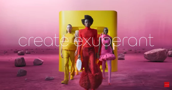
- The logo now emphasizes clean typography, with rounded, lowercase letters spaced out to create a modern and approachable aesthetic.
This redesign prioritizes simplicity and aligns Jaguar with a growing trend in the branding world: minimalism.

Why Did Jaguar Change Its Iconic Logo?
The shift was inspired by a request from the brand’s founder, Sir William Lyons, who envisioned a fresh, modern identity for Jaguar.
Jaguar’s statement accompanying the rebrand emphasized that this wasn’t about copying other brands but about carving its unique path. However, it’s worth noting that this move mirrors what companies like Spotify, Airbnb, Google, and Microsoft have done—simplify their logos to create stronger, more timeless brand marks.
The new design embraces:
- Minimalism: A clean, uncluttered look to appeal to modern audiences.
- Approachability: The lowercase typography softens the brand’s image without losing its luxurious appeal.
- Timelessness: A design that can evolve with the brand’s future ambitions.
What This Means for Jaguar’s Brand Identity
This transformation is more than just a new look. Jaguar is signaling a shift in how it connects with its audience and positions itself in a competitive luxury market. The rebrand reflects:
- A Focus on Modern Luxury: Moving away from traditional elements and embracing cutting-edge design.
- Alignment with Global Trends: Staying relevant by adopting a design language that resonates with today’s audiences.
- A Future-Oriented Vision: Positioning itself as a forward-thinking brand ready to innovate beyond the automobile industry.
Is Minimalism the Future of Branding?
Jaguar’s rebrand raises an important question: is minimalism the new standard for luxury brands? While some critics argue that removing iconic elements risks losing heritage, others believe that simplicity is the ultimate sophistication.
By focusing on typography, Jaguar joins a growing list of brands redefining luxury in the digital age, where adaptability and clarity are essential.
Conclusion:
Jaguar’s new logo marks a bold departure from its storied past. The shift from the leaping jaguar to sleek typography encapsulates the brand’s modern evolution while staying true to its essence: elegance and power.
As branding continues to evolve, Jaguar’s move demonstrates how even the most iconic brands must adapt to stay relevant. What do you think of Jaguar’s new minimalist logo? Share your thoughts in the comments!

